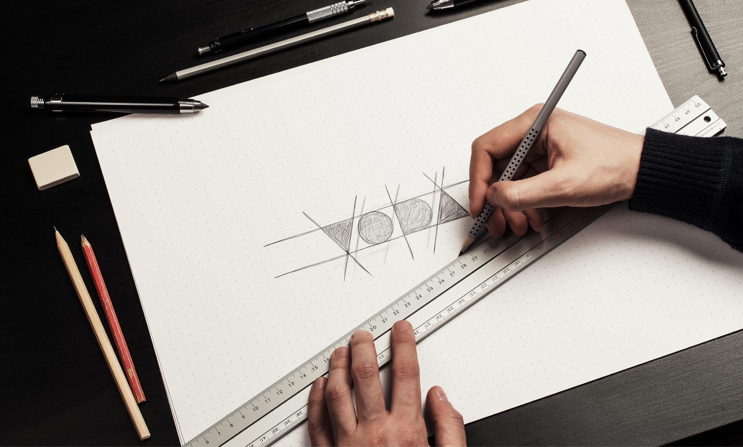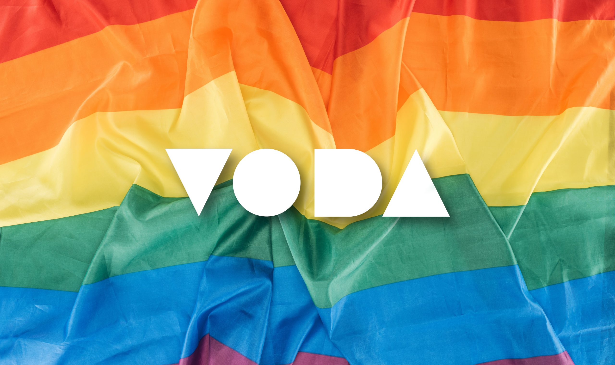
Voda is a platform that is offering support to members of the LGBTQ+ community in dealing with discrimination and abuse. Humans, like the geometric shapes used to form the logo, are very different from one another. Our differences should never divide us, but rather unite us. This was also the idea behind the logo design, having union in diversity.
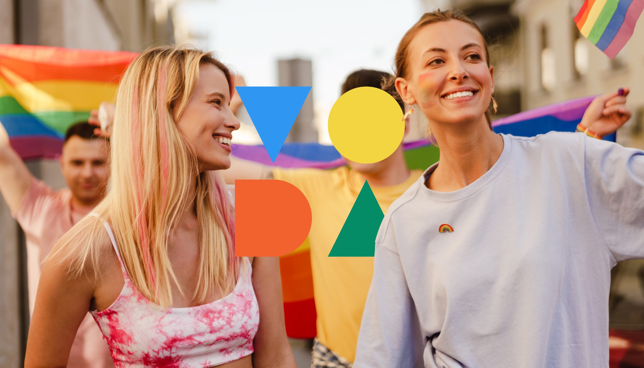
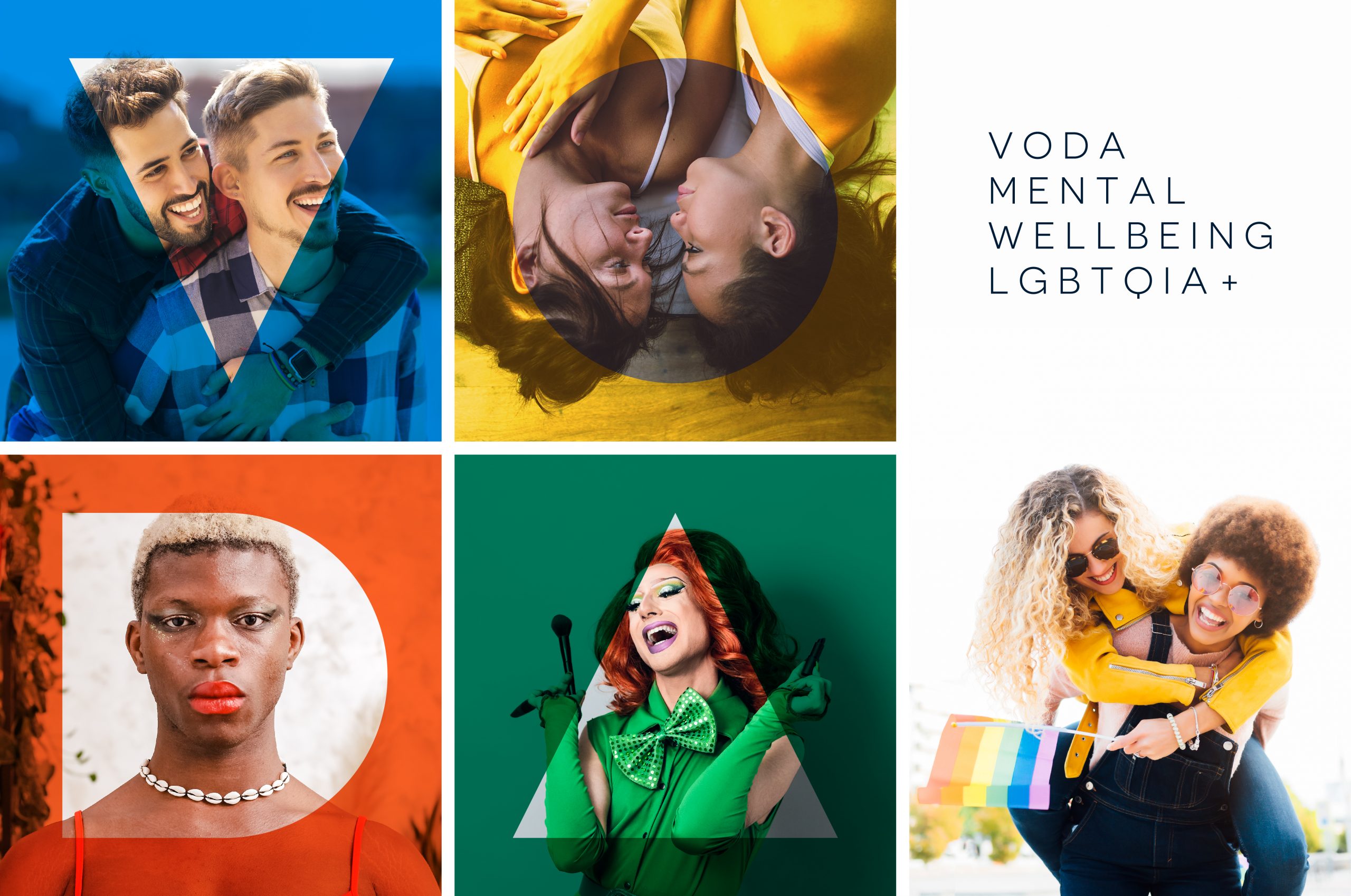
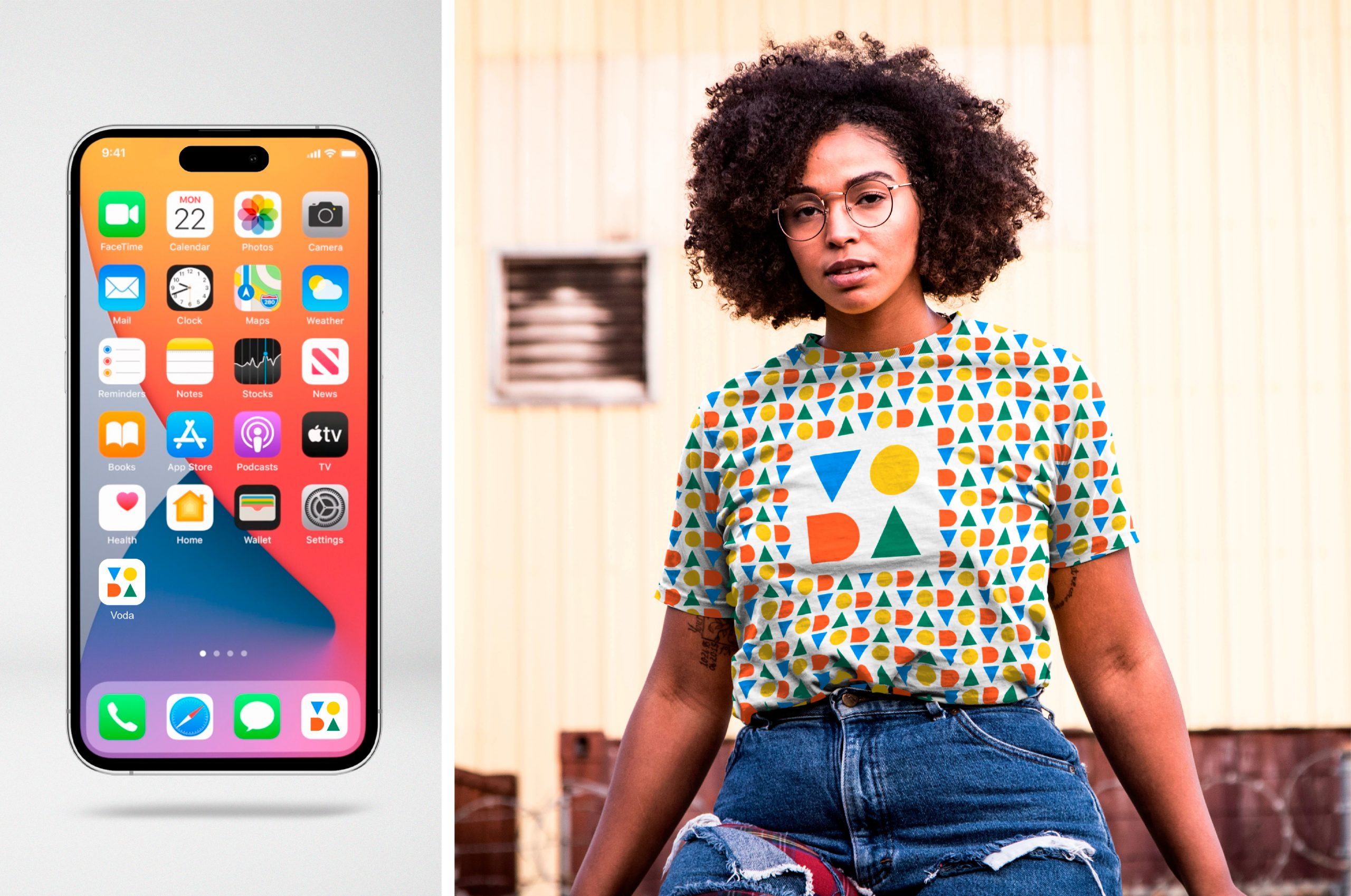
The bold aspect of the shapes used to form the logotype are a perfect expression of the pride values, being different, powerful, loud, strong and united in diversity.The logo strives both when it comes to aspect, but most importantly when it comes to functionality, looking great, being unique and distinguishable when used in various sizes and colours. From as small as a favicon or app icon to being printed on t-shirts or banners, the brand will maintain a strong and consistent identity when using this logo.